College Projects
Highlighted projects produced during my coursework at the Art Institute of Vancouver.
Popaganda Soda Co.
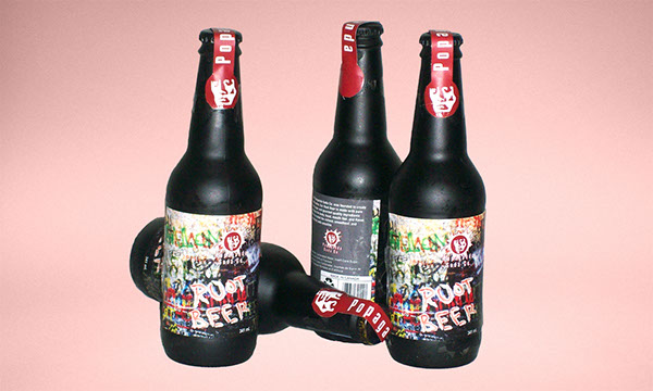
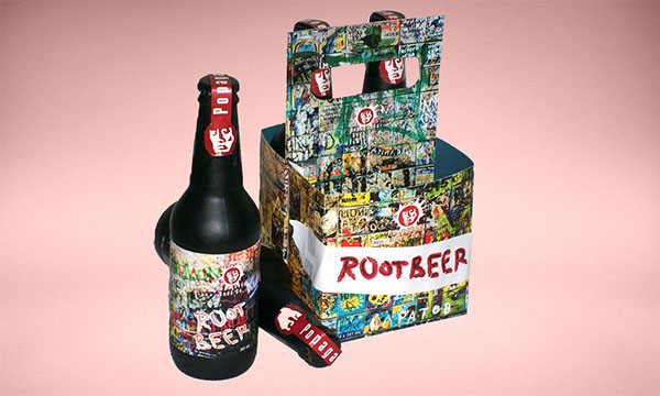
The project goal was to create two branded package and bottle designs for the same product using different themes. Design ideas came from the fairly obvious play-on-words for the company name. One focused on the top-down AgitPop style seen in Soviet Russia. The other counters this with graffiti over a wall chaotic with posters.
Date 2008
Client Class Project
Crafted with Photoshop, Illustrator
Contrasting designs
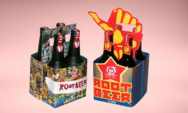
AgitPop influenced
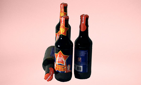
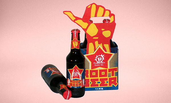
Graffiti influenced
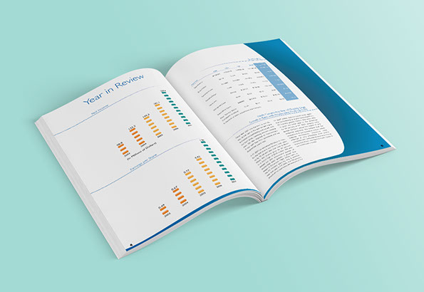
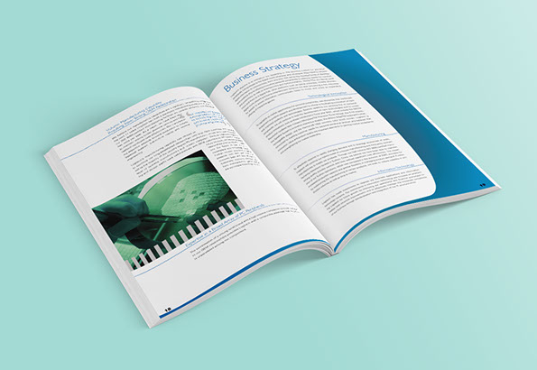
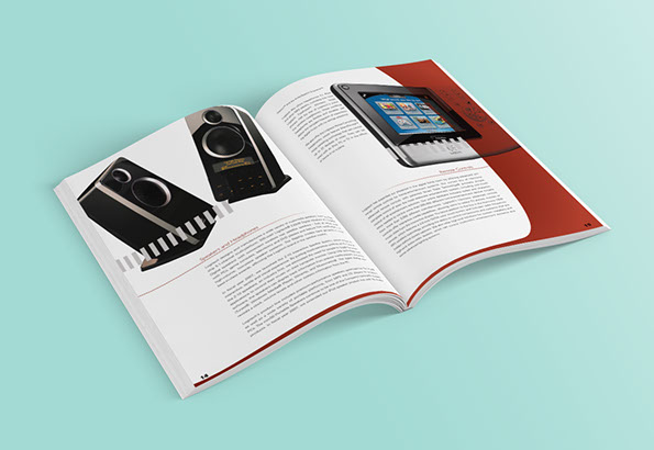
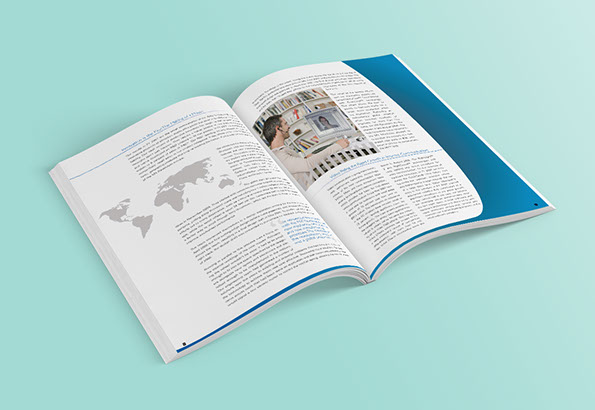
Logitech Annual Report
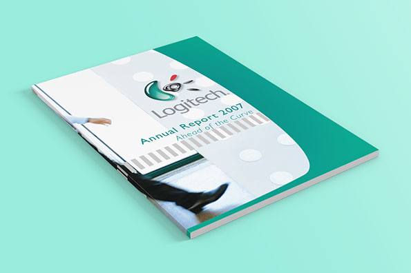
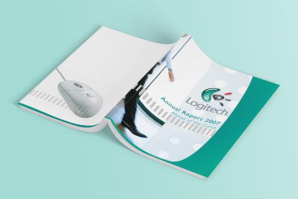
Logitech is a company known for its prowess in electronic peripherals, and this project was the creation of a modern annual report for the company. The concept is reflective of the company - ahead of the curve. Prominent in the type-heavy report are the very peripherals that brought the company to where it was.
Date 2008
Client Class Project
Crafted with InDesign, Photoshop
Covers
Interior
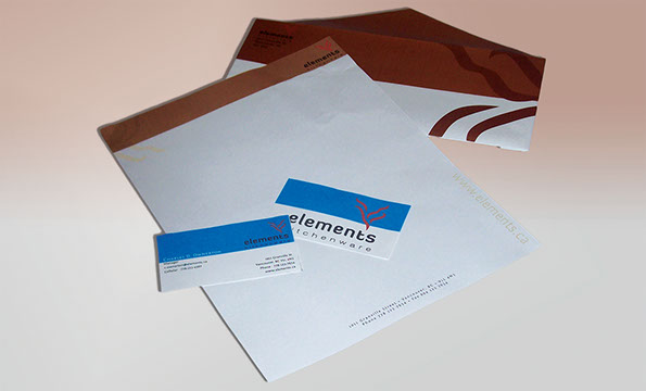
Elements Kitchenware
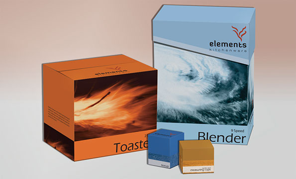
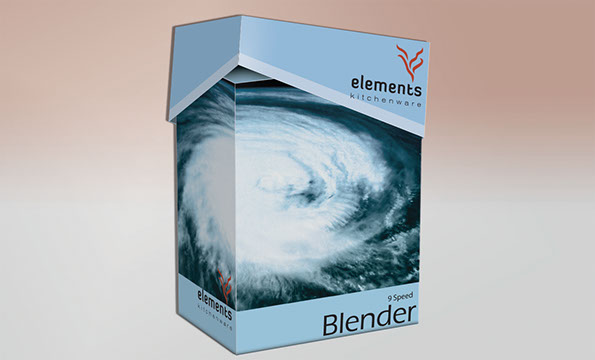
The target of this project is the in-house brand of a boutique kitchen store. Elements Kitchenware takes on various definitions of the word elements. Drawn from the four classical parts–earth, wind, water, fire. The brand covers from counter top appliances and utensils to the catalogue and stationery.
Date 2008
Client Class Project
Crafted with InDesign, Illustrator, Photoshop
Product packaging
Stationery
