TC Energy
TransCanada rebranded themselves to TC Energy in 2019. These are highlighted projects from the transition.
These projects are a result of the rebrand to TC Energy from my in-house design position with Rileys at TC Energy. A completely new brand identity was developed, with fewer restrictions and a new approach. The goal of the rebrand was to connect closer to the destination of the products, as well as show embody the fact that TC Energy is no longer just Canada. This rebrand brought new colours, photographic styles, typography, whitespace goals, and many other elements while simultaneously moving away from templated documents.
This is ongoing as the established documents and collateral are moved to the new brand.
Crafted with InDesign, Illustrator, PhotoShop
Featured projects
Public Awareness
Affected Public booklet
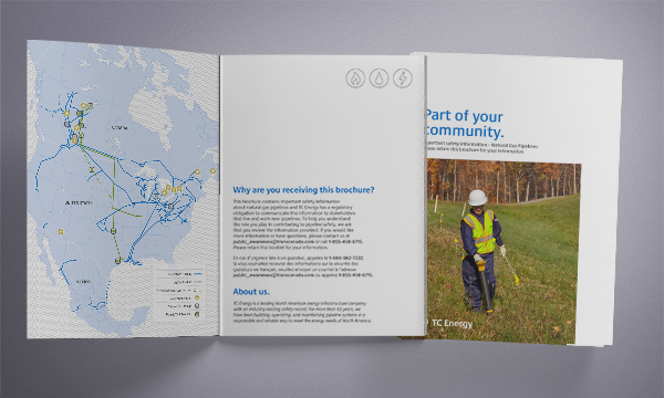
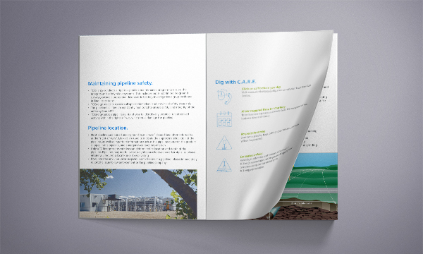
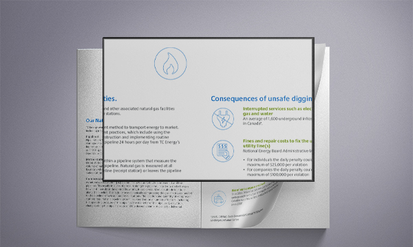
One of the first documents I developed with the new brand was for distribution along TC Energy’s right-of-way, providing information and safety tips. This was a half-letter sized booklet, so readability (as always) was key.
Door hanger
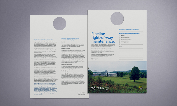
Used as a companion to the booklet, informs the public about work in their area. This piece shows the focus on use of whitespace in the revised brand.
Environment Week
Notebook
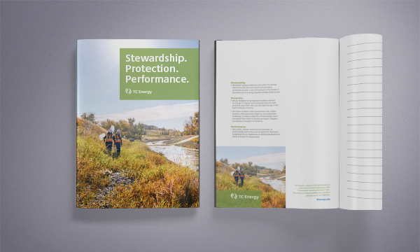
Popup Display
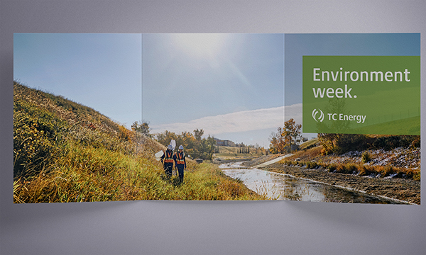
Environment Week was one of the first events to occur under the revised TC Energy brand. Multiple handouts, documents and displays were developed, utilizing the promotional specifications of the guidelines.
Life Saving Rules
Poster

Intended to be displayed around all sites to promote part of the “zero accident” safety culture of the company.